Deliberation: Perspectives, Not Answers
← All PostsSome decisions get worse when the tooling asks me to choose too early.
That sounds backward. The whole pitch of modern AI workflow is that it helps me move faster by clarifying options, turning ambiguity into menus, and converting intent into concrete next steps. Usually that is exactly what I want.
But some decisions are not ready for a menu.
The decisions that tend to matter most to me are often half-formed at first. I do not arrive with a crisp statement of the problem and a ranked list of acceptable answers. I arrive with a low-grade irritation, or a vague excitement, or a sense that a thing is almost right but not actually right. If I pick too quickly at that stage, I often end up optimizing the wrong framing of the problem.
This is a specific class of uncertainty: not “I have no thoughts,” but “my thoughts are not cooked enough to be trustworthy yet.” If the problem is that I need to see a concrete version before I can judge, or that I need to compare implementations, those are different tools. This is about the earlier stage…when the question itself is still taking shape.
Some people make decisions fast. They see the options, pick one, move. I work with people like that. I envy them sometimes. I am not those people. My best decisions tend to come from marinating for a while, looking at the problem from different angles, and noticing where my reactions start to sharpen. The problem is that marinating is slow, and the rest of the workflow is built for speed.
That is what Deliberation is for.
Deliberation does not try to answer the question for me. It assembles a committee of perspectives that have a stake in the question and lets them speak one at a time while I listen. The structure matters. I am not there to debate them. I am not there to score them. I am not even there to respond in real time. The point is to let the reactions happen before I rush to defend a preferred answer.
The first time I felt this snap into focus was while building a college exploration app.
I had designed a chat interface for it. Technically, the design was fine. It had a persistent widget, page-scoped conversations, a reworked onboarding flow, and enough implementation detail that I could have confidently sent it into execution. And did. But I kept poking at it. Tweak after tweak. No conviction. No landing. Something about it was wrong, and I could not name what.
I was not blocked because I lacked output. I was blocked because every output was a little too explainable and a little too dead.
So I ran a deliberation session.
You've been thinking about this — you have a perspective, not just a question.
Let's discern this together.

A few ground rules:

You speak once. Not once per topic — once total. So wait until you have
something that really needs to be said.

You don't have to speak. Silence is not awkward here. If you have nothing to
add, that's meaningful.

Don't react, discern. The urge to respond to each point is normal. Resist it.
Sit with what's shared. If something genuinely arises, share it. If it's just
reaction, let it pass.

This is slow, and that's the point. We're not optimizing for a quick answer.
We're making space for clarity to emerge.

I'll check in with you at natural moments. "Continue" is always a valid answer.

---

The question we're discerning: How should the chat interface work in College
Compass — its form, its relationship to the pages, and its role in the overall
experience?

For perspectives alongside yours, I'd suggest:

1. The Parent — someone using this while juggling work, driving kids around,
stealing 5 minutes here and there
2. The UX Pragmatist — thinks about what actually works in widget-style chat
interfaces (what Intercom got right and wrong)
3. The Data Architect — thinks about conversation scoping, context passing, and
what happens to the information in these chats

Anyone you'd add or change?
Convening the committee
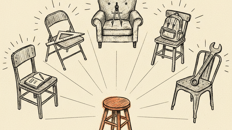
Claude proposed a starting committee… a busy parent, a UX pragmatist, a data architect… and I added a few of my own. A student. A low-tech user. An empath. The perspectives I add myself are usually the most useful because they tend to embody the annoyance I am failing to articulate. They are a way of giving shape to intuitions before those intuitions are polished enough to become arguments.
A student spoke first: This should just be how the app talks to me. Not a feature I find.
That line landed immediately. I wanted to jump in and explain myself. I wanted to say that chat widgets carry baggage, that people are trained to ignore them, that the app was probably signaling “support surface” when I wanted “primary interface.” But the whole point of the exercise was not to argue back. So I noted my reaction and moved on.
Then an empath asked: Is conversation the primary interaction model, or is it supplementary? I do not think you can have it both ways.
Then a UX pragmatist pushed back: You absolutely can. You just cannot have it both ways at the same time on the same screen.
Nothing there was a final answer. That was not the value. The value was in what accumulated… not just from the voices, but from my own reactions as I sat with them. After everyone spoke, the skill reflected back where it saw unity and where it did not. The voices were converging on something: the chat was not a feature. The chat was the app. But there was no unity on what that meant for the dashboard… both wanted to be primary, and that tension was unresolved.
That reflection changed how I saw the problem. I had walked in thinking I needed to decide where the chat widget should go. What came back was that the onboarding was not a one-time flow at all. It wanted to be a perpetual profile conversation. The actual design problem was the relationship between an ongoing conversation and a structured dashboard. Where there was unity, there was a path forward. Where there was not, there was more work to do.
Listening for unity — and naming what's alive.

There's strong unity on several things:

Conversation is the primary interaction model. Every voice arrived here from a
different angle. The chat isn't a feature bolted onto pages — it's how the app
works. Pages provide context, conversation provides interaction.

One conversation per context, not restarted. The Data Architect named it, nobody
pushed back. You come back to Oberlin three weeks later, you pick up where you
left off. Same thread.

Two modes, not two widgets. The UX Pragmatist gave this shape: early in the
journey, conversation IS the page (full-screen). Later, conversation lives
alongside content (integrated, not floating). The transition between these is a
maturity curve, not a toggle.

Page-scoped conversations are tractable. You confirmed this. College detail page
gets a conversation. The intelligence layer synthesizes across them. Clean.

Where I sense the tension is still alive:

The profile conversation isn't onboarding — it's ongoing. You're right that
calling it "onboarding" boxes it in. It's a living conversation scoped to "who
is this student?"

The profile page has the hardest UX problem. It's the one place where the
structured view (extracted dimensions, traits, preferences) and the conversation
are both primary. Every other page has a clear "content" with conversation
alongside it. The profile page has two things that both want to be the main
thing.
Where there is unity, there is a path. Where there is not, there is more work to do.
That is a completely different problem than the one I started with.
Deliberation did not solve it for me. It did something more useful. It surfaced the problem I was actually having.
Deliberation is not a decision engine. It is a grounding mechanism for judgments that are present but still buried. It works when the thing I need is not a recommendation but a better encounter with my own reactions.
And sometimes the output is not a confident yes. Sometimes the committee surfaces a tension that is still immature. In those cases, the best outcome is “not yet.” That is not a failure. One well-timed “not yet” can save a week of building against the wrong frame.
This pattern is not limited to software. I have used the same approach while trying to figure out what to do with a car I am restoring. Different domain, same feeling: too many opinions, not enough clarity. The tool does not care whether the subject is interface architecture or bodywork. It cares that I have something unresolved and that hearing from multiple grounded perspectives will help me notice what I already know.
That is the distinction I keep coming back to. Some tools help when I need an answer. Deliberation helps when I need to hear the question more clearly.
Try it
Deliberation is a Claude Code plugin. Install it and bring a question worth sitting with.
/plugin marketplace add 2389-research/claude-plugins
/plugin install deliberation